A New Opportunity
When Angular 8 was released in late May 2019, one of the features that I was most excited about was the ability to use SVG files as the template for a component. I’ve always been a huge fan of SVG, and over the past two years have heavily experimented with it in both personal and professional endeavors. What’s not to love? Crisp, gorgeous images at any resolution, cleanly defined by standard XML, and manipulable using CSS or JavaScript? It’s made a lot of tricky implementations much more manageable and even fun! My current project is using Angular 8 and also heavily utilizes SVG, so you can imagine that I started looking for use cases within the application immediately.
An Example
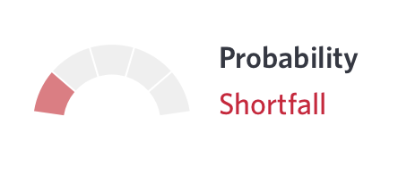
The first one I found was a dynamic “graph” indicator. In the application, the end-user can if they’re on-track to achieve their goals. This is a small span of text accompanied by an image.

Building A SVG Template
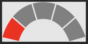
Originally, we were going to use 5 pre-made PNG assets that were provided to us from design. While recreating placeholder images in Illustrator I realized this would be a great way to test Angular’s new capabilities. I created the basic paths and exported them as an SVG from Illustrator. After cleaning up some boilerplate Illustrator markup I had a perfect base template.

<svg xmlns="http://www.w3.org/2000/svg" viewBox="0 0 177.72 84.07">
<g id="probability-graph" data-name="probability-graph">
<path [attr.fill]="getColor(0)" d="M49.78,54.49c6.47-8,13.9-13.36,22.45-16.16L61.93,3.81C46.82,8.55,33.53,17.68,22.56,30.9Z"/>
<path [attr.fill]="getColor(1)" d="M106.22,39.61a55.91,55.91,0,0,1,21.41,16.16l27.06-23.62C143.64,19.07,130.54,9.83,115.88,4.71Z"/>
<path [attr.fill]="getColor(2)" d="M159.22,37.86c-.86-1.16-1.73-2.28-2.62-3.39L129.51,58.11a87.18,87.18,0,0,1,13.59,26l34.62-9.88A123.59,123.59,0,0,0,159.22,37.86Z"/>
<path [attr.fill]="getColor(3)" d="M113,3.77A86.35,86.35,0,0,0,87.46,0,85.35,85.35,0,0,0,64.81,3l10.3,34.52A49.87,49.87,0,0,1,87.46,36a49.36,49.36,0,0,1,15.93,2.56Z"/>
<path [attr.fill]="getColor(4)" d="M20.68,33.24c-1.31,1.68-2.59,3.41-3.83,5.21A118.23,118.23,0,0,0,0,75.18l35,8.26A83.78,83.78,0,0,1,46.51,58.86c.47-.69,1-1.34,1.43-2Z"/>
</g>
</svg>
For each segment in the arc there was a corresponding path tag. All we had to do was color each piece accordingly.
Make An Angular Component
First we had to generate a component. I used to do this manually, but nowadays I tend to use the CLI to generate anything I need. If you want to follow along, this is what I used:
ng generate component /your/path/here/probability-graph
The CLI is beyond the scope of this post, but you can read the excellent documentation at cli.angular.io.
The CLI will generate your component and automatically declare it in the closest parent module. Remember to change this if necessary. The next thing we do is rename the generated html file to svg and change that in the component as well.
Now that we’ve bootstrapped everything we can get to the neatest part - dynamically creating the graph based on inputs! In our application, we have a simple status code being sent back from the upstream service. First, we add it as an input to the component.
@Input()
private _probabilityCode: string;
Bind The Component
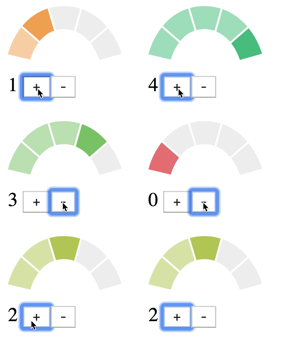
In the parent component, without getting into the business logic behind it, all we need to do is bind each segment so that it gets the appropriate color. Since fill is an attribute on SVG elements you need to use [attr.fill] instead of [fill]. Using the latter results in a nasty warning from the dev server.
Now we can dynamically manipulate all aspects of the underlying SVG as we please! Let's say you don't want to do inline attributes in order to style the SVG. You can add conditional classes using [ngClass] to style elements using the component's stylesheet without worrying about view encapsulation! You want to show or hide parts of the graph based on the application state? *ngIf or [hidden] to the rescue! You can even bind events to dynamically respond to user input.

In this particular use case the assets we were given as placeholders were ~35kb each (don’t judge, they were placeholders). Instead of needing 5 images on the CDN we can have one inline SVG that doesn’t require a network call. The base SVG that we’re using as a template for the component weighs in at a whopping 562 bytes. And since we’re using a SCSS theme file at the top level of our app, we can use variables to define business-approved colors and quickly change them if necessary.
What About You?
Have you built something cool using Angular’s new SVG compatibility? Did you spot what’s wrong with in the code for the SVG? We’re always looking for talented developers to join us here at 1904labs!


